As you’re getting ready for the holiday hustle and bustle, you may have realized some of your window coverings need a new look for the new year. But who has time to look up interior design trends right now?
Don’t worry. We got you covered. We gathered seven Colors of the Year 2023 and curated which of our window coverings are a close match!
You’ll notice a similarity within the variety of earth tones that were chosen. They represent calming themes like reconnecting, reflection, and peace. Perfect for after the holi-daze.
BEHR – Blank Canvas
We love the creamy, dreamy vibes of Blank Canvas. This warm white is a perfect way to start off the new year – it’s literally a blank canvas! And like a canvas, it’s a foundation to support your other pieces of home decor. Behr even vouches it “renews every room of the home.”


Dunn-Edwards – Terra Rosa
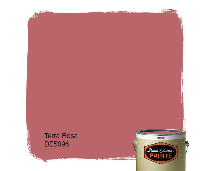
Mesmerize your guests with Terra Rosa, which is part of Dunn-Edwards’ Life in Poetry color palette. This deep pink will create a warm, dare we say romantic, atmosphere in any room.
In their words, Dunn-Edwards describes it as a “high chroma, cinnamon rose hue [that] is strong, yet approachable, and acts as a refreshing neutral updated to browns and burgundies.” With that in mind, you can confidently pair window coverings in this color with one of our taupe curtains/drapes.


Sherwin-Williams – Redend Point

Bring the outdoors in with Redend Point. The earthy tones ground you into a state of relaxation. Sherwin-Williams says, “minimal yet cozy, this color creates a comforting backdrop for the everyday moments that matter.”

Graham & Brown – Alizarin

Graham & Brown went for a deep, muted red with its color of the year, Alizarin, naming it after a pigment used as a dye. They state this color “can be used in small spaces to create a cocooning effect or in larger rooms to transform the space into an opulent abode.”


HGTV Home by Sherwin-Williams – Darkroom

If you’re looking for a more subtle option, HGTV Home by Sherwin-Williams has you covered. Their color of the year is an elegant black with purple undertones that is calming in its simplicity. The brand says, “this alluring black is a classic for heritage interiors, yet modernly retro for a throwback inspired aesthetic.”


Pantone – Viva Magenta

If you’re looking for a hue with more vibrancy to it, look no further. Pantone’s Viva Magenta is the energetic cousin of the red family. Its inspiration is from the cochineal dye.
Pantone describes their color as “a new animated red that revels in pure joy, encouraging experimentation and self-expression without restraint, an electrifying, and a boundaryless shade that is manifesting as a stand-out statement.”


Moving away from the reds, both Gilden and PPG decide to look at the blues and greens in Mother Nature with their Color of the Year, Vining Ivy. Whether you’re looking for a calming presence as you wind down or an energizing color to start the day, Vining Ivy matches your mood.
Glidden describes it as a “‘bluish-greenish-something-in-betweenish’ color [that] serves up versatile vibes, making it an on-trend addition to any room.” Meanwhile, PPG says, “Its versatility takes the guesswork out of design, leaving consumers with more time to indulge in the things that matter most to them.”


Are These Interior Design Trends Not Your Style?
Perhaps you’d like to have one of the colors above be an accent wall, or all the walls, and you’re looking for more neutral window coverings.
In addition to the ones similar to Behr’s Blank Canvas, here are some of our favorite colors on a few blinds and shades.


Call or chat with one of our Design Consultants to discuss which color will work best for your home! Call (888) 257-1840. They’re easy to talk to!